Tern
An AI travel planner that turns one plain-English sentence into a complete, mapped, day-by-day itinerary - and shows its reasoning for every pick. Tell Tern where you're going and how you like to travel, and it plans the days, routes each one to cut backtracking, paces the budget, and puts a plain-language reason next to every stop. A personal product, currently in active design and development.
- Type
- Mobile App · iOS & Android
- Role
- Solo Product Design + Build
- Built
- 2026
- Client
- Personal product · in development
The problem
Planning a trip is mostly logistics wearing the costume of fun. You open a dozen tabs - travel blogs, a maps app, three booking sites, someone's spreadsheet from 2019 - and try to reconcile them into something that works hour by hour. It takes an evening or two, and what you end up with is usually a list of places, not a plan: no real sense of what is near what, what it costs, or how a single day actually flows.
The first wave of AI planners promised to fix that, and mostly traded one problem for another - the black box. You type a request, a confident-looking itinerary appears, and there is no way to tell why a place is on it, whether it fits your budget, or how far it sits from everything else. So you do the only sensible thing and go re-verify all of it by hand, which is exactly the work the tool was supposed to remove.
Tern starts from a different bet: the thing that makes an AI plan usable is not a better list, it is reasoning you can see. If every choice carries its own justification, you can trust the plan at a glance instead of auditing it. That single idea - reasoning as the product, not a feature - shapes every screen that follows.
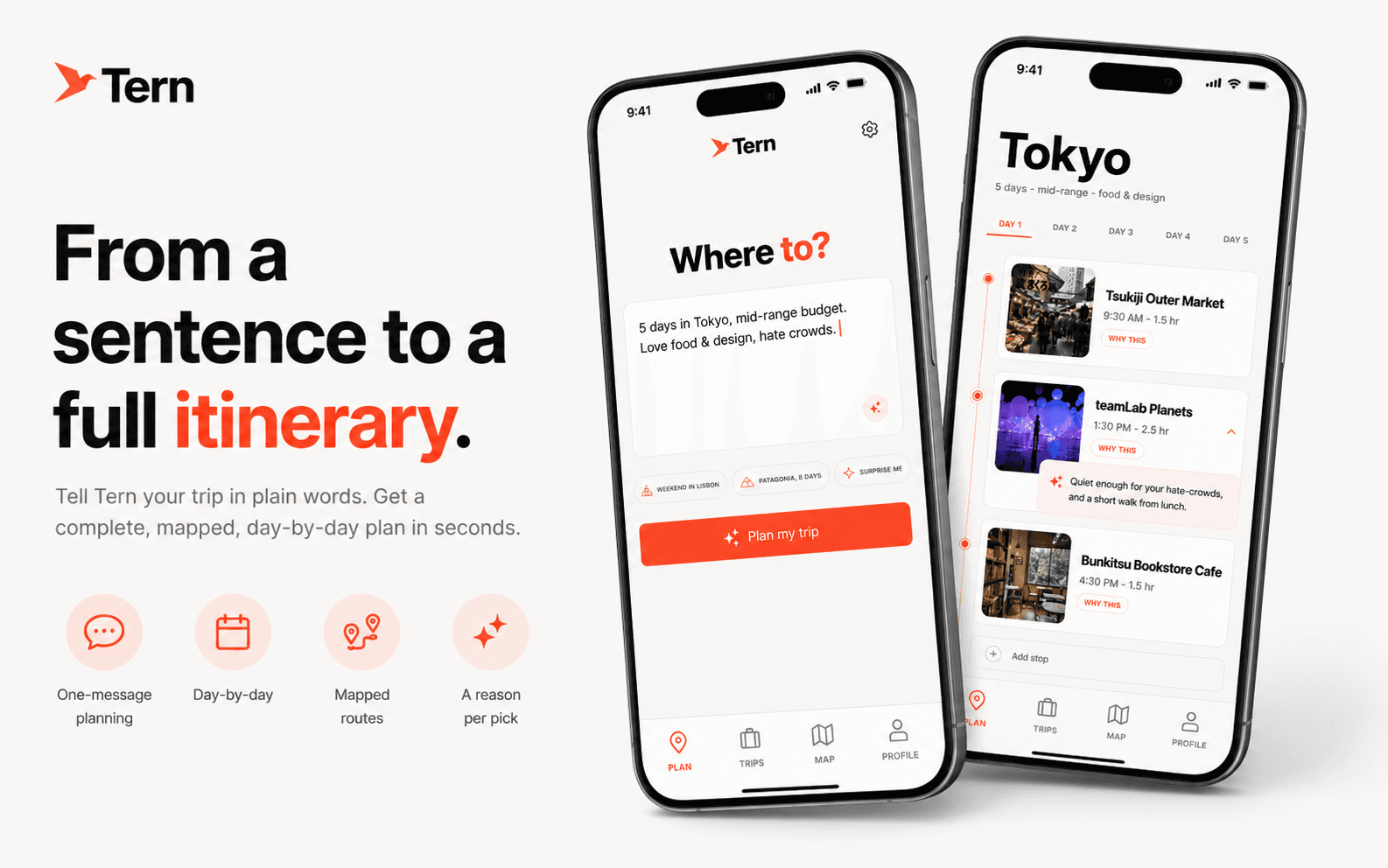
From a sentence to a full plan
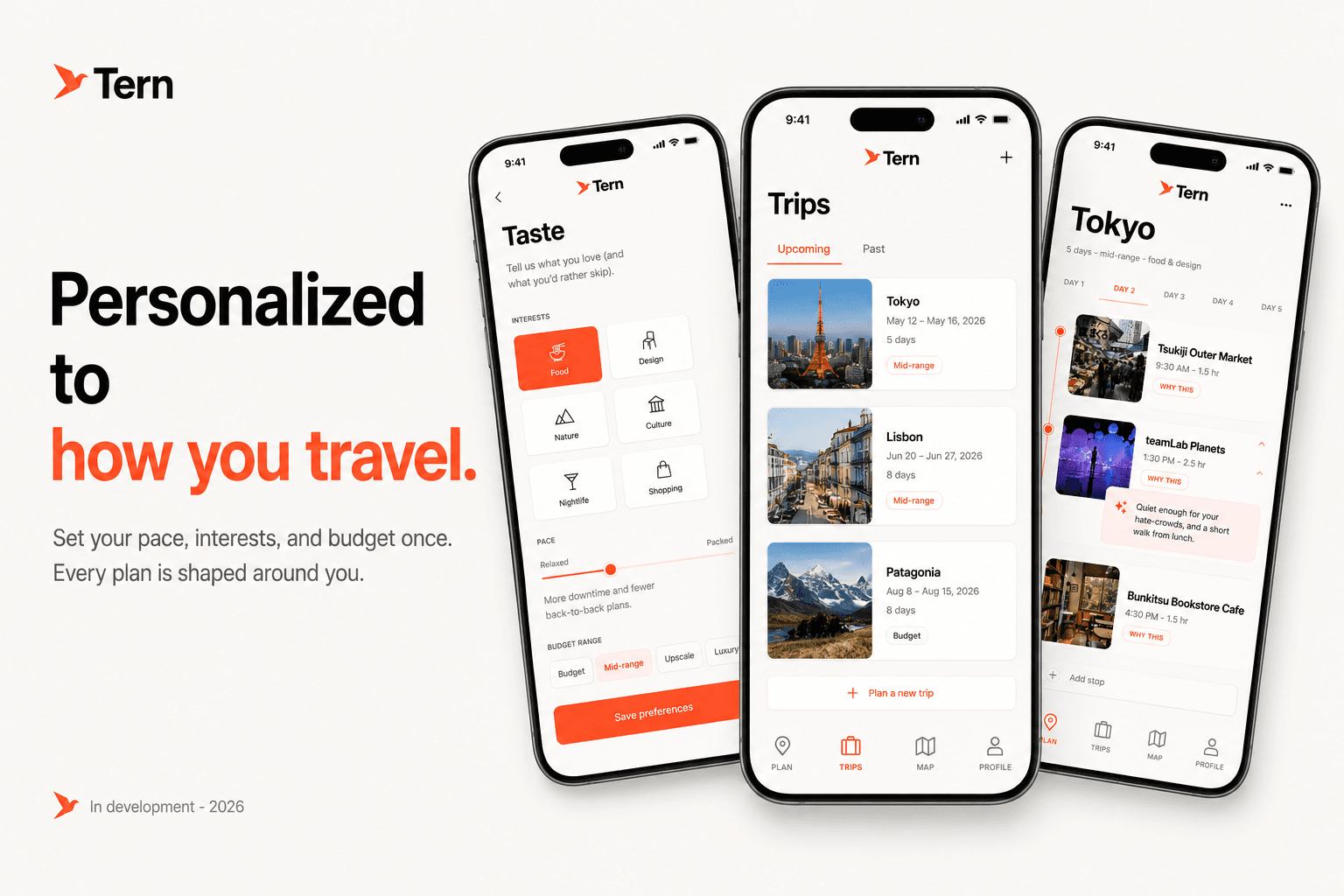
Tern's entire front door is one plain-English sentence. You describe the trip the way you would to a friend - 'five days in Tokyo, mid-range budget, love food and design, hate crowds' - and Tern returns a complete, day-by-day itinerary: stops paced across morning, afternoon, and evening, each one placed on a map, costed against your budget, and explained in a line.
Natural language is the point, not a gimmick. People already think about trips in sentences, not in filter menus, and a sentence carries the soft constraints - 'hate crowds', 'love design' - that a form would throw away. Tern's job is to turn that fuzzy intent into a concrete, editable plan without flattening the nuance out of it.
That first generated plan is the whole product in a single move. Everything else in the app - the map, the budget, the edits, the saved trips - exists to refine and trust that plan, not to make you assemble it. It is one React Native app, iOS and Android from a single codebase, so the experience is identical wherever you start.
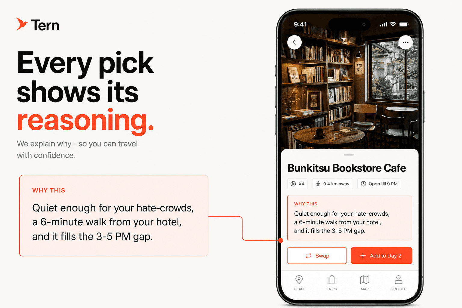
Every pick shows its reasoning
Every recommendation carries a one-line reason, written in plain language: 'quiet enough for your hate-crowds, a six-minute walk from your hotel, and it fills the 3-5 PM gap.' It names the constraint it satisfies, the spatial fact, and the slot it fills - the three things you would otherwise go and check yourself.
Crucially, the reason is generated alongside the pick, from the same constraints that selected it - not written afterward to justify a choice already made. That ordering is the whole game: a justification bolted on after the fact is marketing, while a reason produced as part of the decision is evidence. It is the same discipline I built AuraHire on, where no score ever renders without the breakdown that produced it.
The payoff is trust at a glance. Instead of opening five tabs to sanity-check a suggestion, you read one line and move on - or you disagree, and swap it. Either way you are making the call with the same information the model had, which is the entire point of a plan you can actually see into.
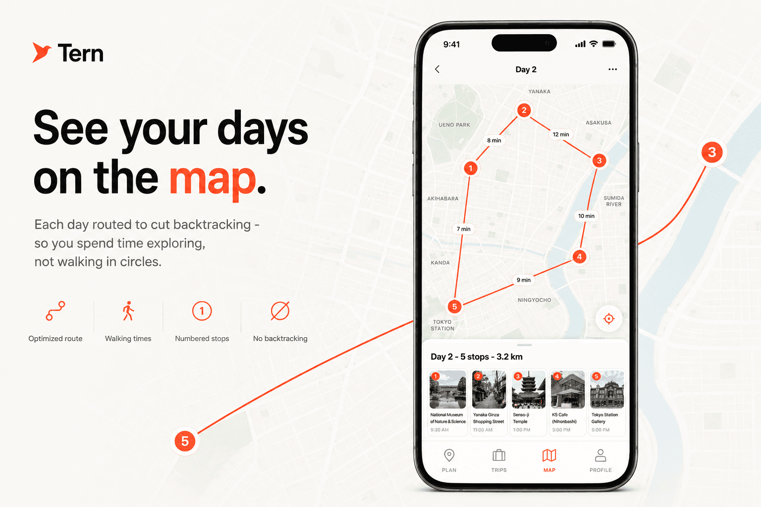
Each day, actually routed
A plan can read perfectly and still have you zig-zagging across a city - a museum in the north at ten, lunch back south at noon, a gallery north again at two. Tern orders each day to minimize that, then shows the walking or transit time between every stop, so the route is one you would actually walk rather than a tidy list that falls apart on the ground.
This only works because the itinerary is real data, not prose. Every stop carries true coordinates, so a day can be sequenced, mapped, and timed by the app instead of guessed at by the model. The map is not a decoration bolted onto a text plan - it is the same plan, drawn.
It is a small thing that changes how a trip feels in practice: less time navigating, fewer 'wait, we were just here' moments, and more time actually inside the places you came for.
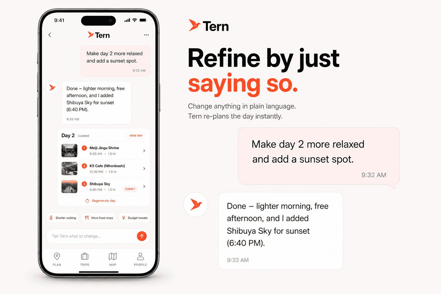
Change it by just saying so
A first plan is a starting point, not a verdict, so changing it has to be as easy as asking. Tell Tern 'make day two more relaxed and add a sunset spot' and it re-paces that day in seconds - thinning the morning, freeing the afternoon, and slotting the new stop where it actually fits the timing and the route.
Because each day is a structured object rather than a block of text, Tern can edit one day in place without regenerating the whole trip. A small ask stays a small change: the rest of your plan, including the stops you have locked, does not get quietly rewritten underneath you.
That keeps you in control without turning you into a project manager. You steer in plain language; Tern handles the re-pacing, the re-routing, and the budget math that the change sets off.
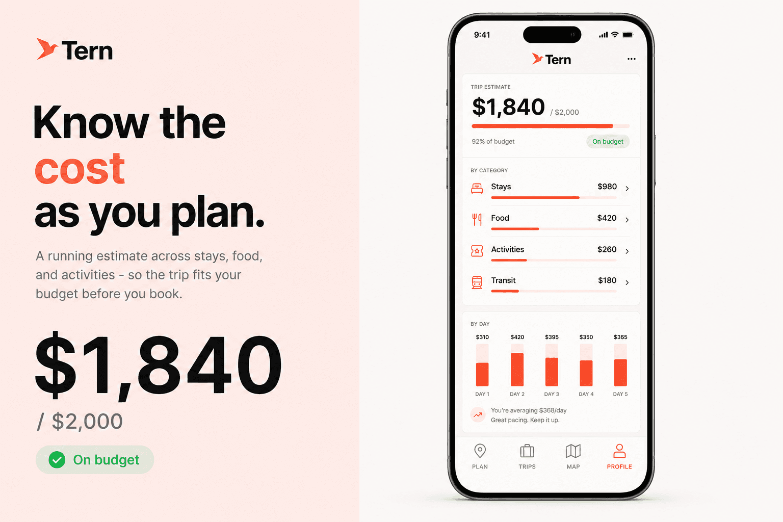
Costs you can see as you plan
Money is usually the last thing you find out and the first thing that derails a trip. Tern treats budget as a first-class part of the plan rather than an afterthought: a running estimate across stays, food, activities, and transit, paced day by day against the number you set.
Every stop carries a price band, so the total updates the instant you swap or add something - you see a choice's cost while you are making it, not at checkout. When a day drifts over, Tern flags it gently instead of silently blowing the budget.
The result is a plan that fits before you book. No surprise totals, no quietly-expensive day three - just a trip you can actually afford, visible the whole way through.
Built around how you travel
Two people who both ask for 'five days in Tokyo' do not want the same trip. Tern keeps a short taste profile - your pace, interests, budget band, dietary needs, and the things you would rather avoid - and shapes every plan around it, so you are not re-explaining yourself on each new trip.
Plans you like are saved, shareable, and exportable, so a trip lives in one place instead of scattered across screenshots and group chats. Over time, that profile is what turns Tern from a generator into something that feels like it knows how you travel.
It is the difference between a generic itinerary and one that reads like it was made for you - because it was.
Under the hood
The single most important engineering decision is that the model never returns prose the app has to parse. Every plan comes back as structured output validated against a Zod schema, so an itinerary is typed data end to end - days, stops, coordinates, time windows, price bands, and a reason string for each stop. The screens render a real object, never a guess.
That one rule is what makes the rest of the app possible. A stop can be mapped because it carries coordinates; costed because it carries a price band; re-paced because a day is a structured unit you can edit on its own. Reasoning is durable for the same reason - the 'why this' is a field on the stop, so it travels with the plan instead of living in a chat log. No prompt without a schema, the same rule I held on AuraHire.
The build is one React Native and Expo codebase for iOS and Android, kept as a pure UI layer with no model keys of its own. A thin backend owns the AI and the data: it calls the model with structured outputs, validates every response against shared Zod schemas, enriches stops with real place data and photos from a maps provider, optimizes each day's route, and persists saved trips in Neon Postgres. The same itinerary shape is enforced in the model's response, at the API boundary, and in the screens - so a change to the shape is a compile error, not a runtime surprise.
Key decisions
A handful of constraints shaped the whole product and keep it honest.
Reasoning is the product
The 'why this' is not a nice-to-have bolted onto suggestions - it is the reason the app exists. Every pick is generated together with its justification, and a pick that cannot be explained does not ship.
No prompt without a schema
Every model call returns Zod-validated structured output, so the app renders typed objects rather than free text. That is what makes mapping, budgeting, and single-day edits reliable instead of best-effort.
Edit in place, never silently regenerate
A change to one day touches one day. Locked and untouched stops are preserved, so refining a plan never quietly rewrites the parts you were already happy with.
The phone is a pure UI layer
All AI, keys, place data, and persistence live behind Tern's own API. The app holds no secrets and renders only what the backend has validated - simpler to reason about and safer to ship.
Status and what's next
Tern is a personal product in active design and development. What you see here is what I am building and the thinking behind it - not a shipped app with usage numbers I have not earned yet. I would rather show the reasoning honestly than dress a concept up as traction.
The first milestone is the core loop, end to end: a sentence in, a typed and mapped multi-day plan out, with a reason on every pick and plain-language edits. That is the smallest version that proves the bet - a plan you can trust at a glance.
After that comes saved trips and sharing, offline access for when you are actually on the road and the signal is not, and live re-planning when a place is closed or the weather turns. As the build ships, this is where concrete, non-sensitive outcomes will go.
Cache
A private, on-device second brain - capture anything, and it never leaves your phone.
Native iOS App · ConceptHave a project in mind? Let's build it.
I'm available for freelance projects, and open to the right full-time role.
I build web apps, SaaS, and MVPs for founders and startups. Tell me what you're working on.